
Thursday, December 6, 2012

Tuesday, November 20, 2012

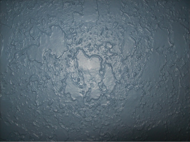
Designboom example of texture
http://www.designboom.com/design/tokujin-yoshioka-phenomenon-for-mutina/
Tuesday, November 6, 2012
Tuesday, October 30, 2012
Homework #4
Homework
#4
Chapter 9:
1.
Describe
three ways to define a pattern in art or theory?
-surface
activation accomplished through repeated marks or shapes
-dynamic
way of capturing visual interest
-reduction
of a grid of some sort
2.
How can a
grid help to define a pattern?
It
results in a sense of balance and order within a pattern, making it unified.
3.
Describe
the similarities and differences in pattern and texture?
They
are similar in the sense that both of them provide appealing designs to the
eye, but are different in the sense that texture adds a false sense of touch to
determine what the design might feel like.
4.
How can
texture be used to create visual interest?
It
can activate our sense of touch, instead of only our sense of vision in an
image.
5.
What is
the difference between actual and implied texture?
Actual
texture can be truly felt and is actually present, while implied texture only
gives the illusion of a sense of feeling.
6.
How do
you define collage? Give an example
A
form of art using a variety of different materials, usually paper, magazine
clippings, and photographs, to create a whole composition. An example would be
scrapbooking.
7.
What is
tromp L’oile? (French term: fool to the eye)
When
a two-dimensional image creates the illusion that it is three-dimensional.
Chapter 10:
1.
Define
Value and a value scale
Value-
A measure of relative lightness to darkness.
Value
scale- A scale that shows the gradual change from light to dark colors.
2.
What is
achromatic gray?
Black,
gray, or white with no distinctive hues.
3.
What is a
Value contrast?
Value
contrast- The relationship between areas of dark and light.
4.
How do
you create balance in a composition with value?
Equal
values on opposite sides throughout a piece can create a sense of equality and balance in the piece as
a whole.
5.
How do
you create emphasis with value, give an example?
An
example would be adding more prominent darks (or lights) to an area of a piece
to show the intended emphasis in that area.
6.
What is chiaroscuro? What period in art history was the word
originally used?
The
use of light and dark values to imply depth and volume in a two-dimensional
work of art. It was a term that developed during the Renaissance.
7.
What is aerial,
or atmospheric perspective? Give an example.
The
perception of less-distinct contours and value contrasts as forms recede into
the background. Colors appear to take the color of the atmosphere. It gives the
illusion that a piece is fading into its background.
This piece of design successfully
demonstrates the use of value in art. Its value scale creates
more realistic shadows and unifies the piece better without the use of strict
black and whites. These are three-dimensional candle holders, but their designs
cause them to stand out far more than any average candle holder would. Achromatic
colors are noticeable. Blacks, whites, and grays stand out, but because the
piece looks like pointillism, there are no actual hues used.
Areas of darks and light in this piece
are made even bolder by its value contrast. There is a strong emphasis
around the facial features and hair, because these areas are much darker
compared to the skin color of the girl who is depicted on the candle holder. I
feel that chiaroscuro is also used, due to the fact that the girl has a
generally realistic appearance while the image itself is only two-dimensional.
Tuesday, October 23, 2012


Subscribe to:
Posts (Atom)